After completing a one-year long junior data engineering traineeship (now known as the Data and ML Engineer Program) at Xomnia, Maria Papadaki, Bas Hendrikse, and Norico Groeneveld created the “Uncovering the Truth” Dashboard, a prototype for a platform that gathers and visualizes data about what is going on in the world. Our data engineers explain their capstone project in the following blog.
We live in an age of information overload, and many people find it challenging to distinguish between what is true and what is not. With the rise of conspiracy theories, which populate quickly in the curated digital world, it is easy to get lost in an echo chamber of disinformation.
As the debate around what is ‘true’ can get quite heated nowadays, we have decided to come up with a satirical project in which we poke humor at the analyses some people make in support of their somewhat dubious statements (think of people who defend the flat earth theory and present all kinds of numbers and figures to support their argument).
We created the - satirical- “Uncovering the Truth” dashboard as our capstone project. The project aims to help its users follow ‘facts’ for themselves. This project is the result of what we learnt during our one-year long data engineering development program at Xomnia, which involved weekly technical training and professional development training. During our development program we also worked for clients, where we gained a lot of Data Engineering skills that we applied in our capstone project.
To know more about the Data and ML Engineer Program at Xomnia, click here.
The “Uncovering the Truth” dashboard
Software as a Service, Platform as a Service and Infrastructure as a Service are common terms in the IT world. Our capstone project, “Uncovering the Truth”, presents a new type of service ‘Truth as a Service’, an online platform with an interactive dashboard accessible via the browser.
As Data Engineers, we bring data together such that it is usable for further usage and analysis. We work with large amounts of data from various sources and use all different kinds of technologies which are suitable to deploy tooling and to store and process the data.
The focus of our project is, therefore, on the process before data is analyzed. Even though we are not data scientists (who normally do the final analytics step) we still attempted to find absurd and farfetched correlations between ‘very interesting’ datasets (Did you know, for example, that there are links between the net worth of Bill Gates, the number of times a UFO was spotted and the number of Xomnians over the years? We found it very curious at least....)
The architecture behind this TaaS platform
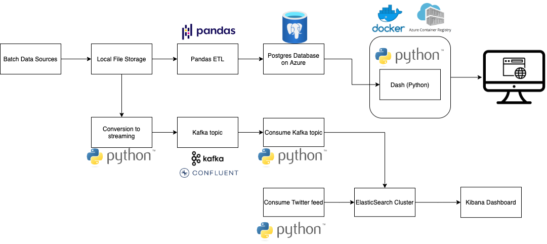
We created a data processing pipeline using the services described in the picture below. We began our search for spurious correlations by looking for interesting datasets on the web. We extracted those mainly from Kaggle (e.g. this one or this one), stored them locally for now and processed them with Pandas in Python. Afterwards, we stored the ready-to-use data in a Postgres database, which we hosted on Azure. The application was made with Dash in Python, which made it easy to combine Pandas with interactive Plotly charts and controls.
We also added streaming support in our platform. It has no real use now (but who knows, it may be one day filled with reports about Big Foot sightings someday in the near future!). We used a managed Kafka cluster from Confluent Cloud to ingest streaming data and linked it with our ElasticSearch cluster with a Python consumer. A Kibana dashboard was used to visualize this data, as well as a Twitter feed to get the latest news on the topic. We also prepared to do the ETL in Spark instead of Pandas, but the latter was more suitable for now.

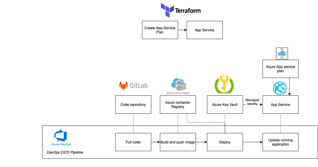
Regarding the cloud environment, we chose Microsoft Azure. Our code was stored in Gitlab, and an Azure DevOps pipeline got triggered every time a change was merged to the master branch. The pipeline was responsible for building the Docker image, pushing it into Azure Container Registry and deploying it to an Azure Web App. This was achieved with the ‘Docker Compose’ task as well as the ‘Azure Web App for Containers’ task.
In order to keep the sensitive information of the project safe, such as the database credentials, we used secrets in Azure KeyVault. The secrets were provided to the App Service via Key Vault references. For the App Service to connect to Key Vault, we enabled Managed Service Identity. It is also worth mentioning that the secrets were initially provided to the Web App through the DevOps pipeline, specifically during the deployment step, and App Settings using KeyVault reference syntax to access them.
Moreover, we used Terraform in order to manage our cloud provider, create the Azure App Service Plan, as well as the App Service.

To know more about the Data and ML Engineer Program at Xomnia, click here.
Conclusion
The outcome of our project is a publicly available online dashboard built on a solid technological basis (which, nevertheless, presents not so solid evidence about the truth in the world).
We had some more wishes for our project, such as an implementation with Kubernetes instead Docker Compose and to use Spark instead of Pandas. Although we did not make use of Machine Learning, it could be applied in future work to predict trends in the data (or maybe to find out where Big Foot truly is located!).
One thing is true for sure, doing this project together with our class was a lot of fun and was a great way to end our year as Juniors at Xomnia. We hope that you enjoyed reading this story and can also see a funny side of these weird times we live in!


